
Hello everybody. It’s time for another GSoC report. In this period, me and my mentor, with the precious help of Seif Lotfy, decided to port our application from Clutter to pure GTK.
Why the Port?
Well, initially I chose Clutter because it seemed the best match with requirements we set up for implementing the timeline view that came out of our design process. I wanted nice transitions, effects and so on. Also, I wanted to improve my Clutter skills.
And actually, Clutter is a very nice and powerful lib, but we decided to switch to GTK for the following reasons:
- Citing Emmanuele Bassi (Clutter’s maintainer):
if you’re trying to create a spreadsheet, a standard toolkit is definitely the best
choice. same goes for a classical, mostly portable application.
if you’re writing a media center, or a mobile UI, both Clutter and a standard toolkit have had validation in those areas – both in commercial and open projects. - No need for Hardware Acceleration
- Feasibility was evaluated ok. And we actually found a way to implement the timeline with GTK. You guess for yourself, if that was some work 🙂
- I’m much more expert in GTK than in Clutter. Originally, I wanted to learn more Clutter, but that’s the way life goes.
Status and Current Plans
First, here you are with a screenshot. Yes, it’s GTK …
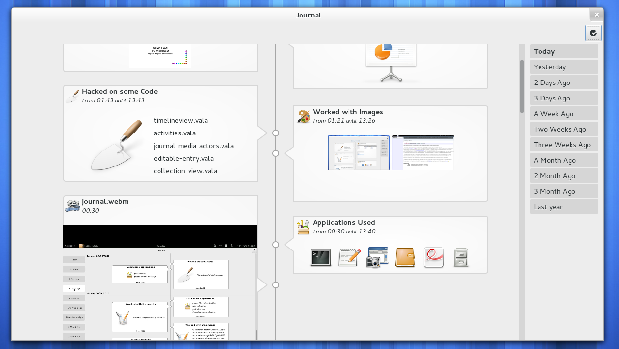
The timebar on the right now works better. We have video bubbles. And application bubbles, which show you the most used applications of the day, most-used one first.
The porting is almost finished and we will devote our next month to adding new features, such as integration of calendar items. Search will be revamped, including visual guidance to days further in the past, which hold matches. The dynamic Timebar also still needs work. And there is more.
Basic things will need attention too. Interaction with the ‘Journal experience’ still doesn’t feel smooth enough for me to be pleased with it. So there’ll be things popping up, I’m sure.
By the way, Thorsten is writing a row of posts with recaps, reflections, and thoughts about where the Journal’s journey might be taken. Here’s his blog.
See you at GUADEC!!


I know it’s not yet finished, but it misses “This week”, “This Month”, and “This Year”.
As an alternative, how about a combo or radio to choose “Day”, “Week”, “Month” or “Year”, and a slider to scrub through till the bigger division i.e. day=1-7 (Today – A week ago), week=1-5 (This week – A month ago), month=1-12 (This month – 1 Year Ago), year=1-? (This year – Start of history)
Either way there is a risk of performance issues (you may already have designed for these) if you try to view an entire years timeline.
So, this is a Facebook timeline, isn’t it? 🙂
Apparently, and it’s just as confusing.
Instructions for understanding timelines:
1. The further down the timeline you go, the older things are.
2. Read from left to right.
You have now completed your course on timelines.
That only works if you pay attention to the thin line in the middle instead of the big boxes that hold the content you’re actually trying to read. For example, if you’re currently looking at the “Looked at images” box in the middle right and you wanted to go to the previous event, the intuitive thing would be to look at the big box in the bottom left, since it is both the next box down (over the whole width of the timeline) and it also follows the general zig-zag pattern to look at the other side next. But that would be wrong, because the actual previous event is the smaller box directly below the current one. But in order to realize that you have to first follow the small arrow from the current box to the middle line, then follow the thin line down, and then finally follow the small arrow right to the actually interesting box. That is way more effort than simply following a linear timeline of the actual content.
Just a small observation: why is the sidebar on the right? In all other GNOME apps that I can think, it is on the left.
We are still deciding its position 🙂
Amazing work folks….so looking forward to use this at work. The old Gnome Activity Journal falls short to me in many ways (thumbnails bugs, crashes, information display…) to be actually usable.
Thumbs up!
Pingback: GSoC Baseline: Recap of Activity Journal – Current Status (0.8.0 Release), Part 2 « Personal Experience Computing
certainly like your website but you have to test the spelling on quite a few of your posts. A number of them are rife with spelling problems and I in finding it very troublesome to tell the reality nevertheless I will certainly come back again.